
Brand Colors
The primary colours of the Clubhouse™ identity all take cues from the field of play. These colours have been chosen to represent the authenticity of our brand. "Swish" (orange) is our primary brand colour, it's dominant, attention grabbing and a dynamic representation of our drive to push the boundaries of sports media. The "Turf" (green) forms an instant connection with most playing fields, and is easily adaptable to suit a variety of mediums. "Off-court" (white) is a neutral tone that reflects the well used sidelines of most surfaces. It's our workhorse, and a colour that is equally suited as both a background or foreground. You can never go wrong with "Scoreboard" (black).
Primary Colors
Because of the difficult and ever-changing lighting environments that sport often takes place in. Our preference is to always use the logo with highest contrast for on screen graphics, broadcast, field of play signage, and any other visual assets that might be influenced by changing light conditions. This will mean that the 'Off-court" and "Scoreboard" colours should be used as preference in these situations.
SCOREBOARD BLACK
HEX #0E0E0E
RGB 14 14 14
CMYK 0 0 0 95
OFF COURT WHITE
HEX #F2E4DB
RGB 242 228 219
CMYK 4 10 11 0
Secondary Colors
Where we have greater control over the environment we can be more creative in our approach. "Turf" and "Swish" will create a meaningful presence when applied in environments like dark arenas or indoor stadiums, on merchandise, LED signage, digital display, and other online mediums.
SWISH ORANGE
HEX #E86A33
RGB 232 102 51
CMYK 4 72 92 0
TURF GREEN
HEX #41644A
RGB 66 100 74
CMYK 74 40 75 29
Brand Typeface
The brand font for Clubhouse™ is Aoi Mono. A sporty, modern and highly legible typeface that was designed to be used in digital interfaces.
One of the key features of Aoi Mono is its support for numerical symbols, which means it can be used well for social media graphics, and broadcast overlays. This makes it a great choice for a sport media brand like Clubhouse™. Additionally, the font is designed to work well on screens, which is essential for a digital consumption of our brand.
The brand typeface should be used exclusively for graphics, titles, and heading areas. We also provide a sub-font "Inter" below which is best used for paragraphs and text rich elements.

Weights
Inter is a variable-weight typeface, which means you are able to customize weights and angles to create an infinite number of weights. That being said, we typically stay within these two weights.
Use contrast between heavy and lighter weights to communicate relevant importance, otherwise known as hierarchy, of information.
Aa Bb Cc Dd Ee Ff Gg Hh Jj Kk Ll Mm Nn Oo Pp Qq Rr Ss Tt Uu Vv Ww Xx Yy Zz (0123456789) / ? ! . ; : " ' | $ % & *
Inter Regular (2-3 line text blocks)
Aa Bb Cc Dd Ee Ff Gg Hh Jj Kk Ll Mm Nn Oo Pp Qq Rr Ss Tt Uu Vv Ww Xx Yy Zz (0123456789) / ? ! . ; : " ' | $ % & *
Inter Light (Paragraphs)
Aa Bb Cc Dd Ee Ff Gg Hh Jj Kk Ll Mm Nn Oo Pp Qq Rr Ss Tt Uu Vv Ww Xx Yy Zz (0123456789) / ? ! . ; : " ' | $ % & *
Using Type Rules
When constructing layouts, these tips will help you build interesting, and on-brand compositions with typography.
While these rules are proven and sound, sometimes we break these to best communicate in certain circumstances. Please contact our brand team if you wish to gain special use permission.
1 – Stay Left-Aligned
Legibility and clarity are vitally important to great typographical layouts. Since most people read from left to right, we should align our type accordingly.
2 – Skip Weights & Double Size
Contrast is the name of the game when it comes to great design. When in doubt, skip a weight when pairing two weights, and double the size between two text elements.
3 – Align X-Heights or Baselines
Whenever you place text next to each other, either align the baselines (the line that the bottom of a lowercase x sits on) or align the x-heights (the top of a lowercase x). This helps align each line visually.
4 – Watch The Rag
When setting paragraphs, keep an eye on the right (ragged) edge. If the rag unintentionally creates a recognizeable shape, consider tweaking the language or resizing the container. Also, try to prevent single-word lines (orphans).
5 – Give Things Space, If Needed
Negative space, or the space around elements is vitally important. That being said, if informational elements belong together, move them closer together. Use grouping wisely: just try not to cram too many things in one space!
6 – Keep Line Length Reasonable
It is easy for the user to get lost in long lines of text, and short ones are easily ignored. It’s best to keep lines between 45 and 70 characters long, depending on the size of the font. This will ensure legibility as the font sizes increase or decrease.
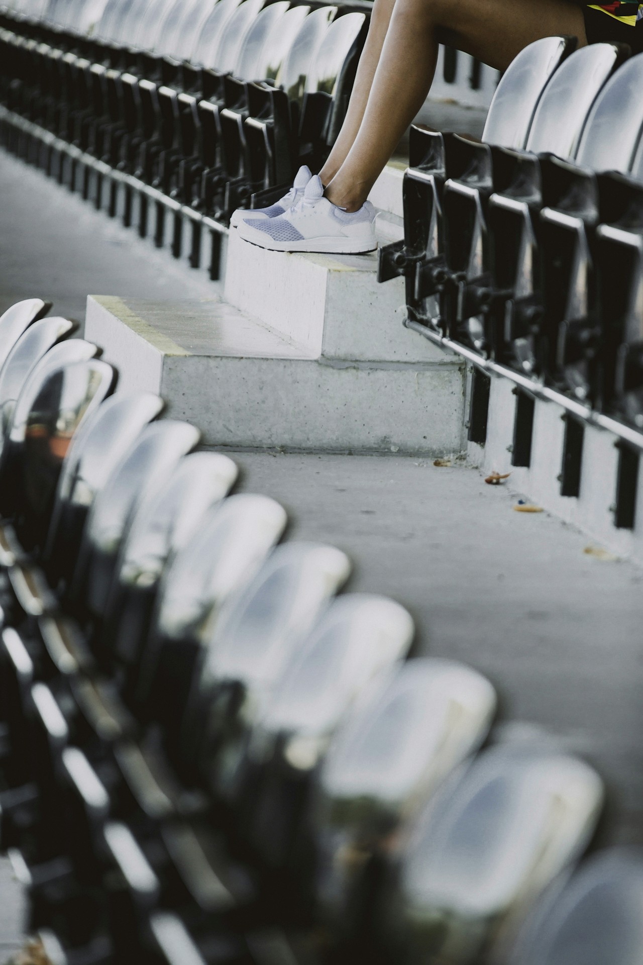
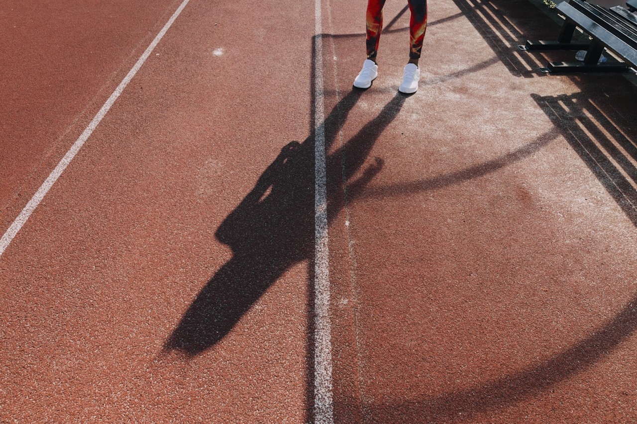
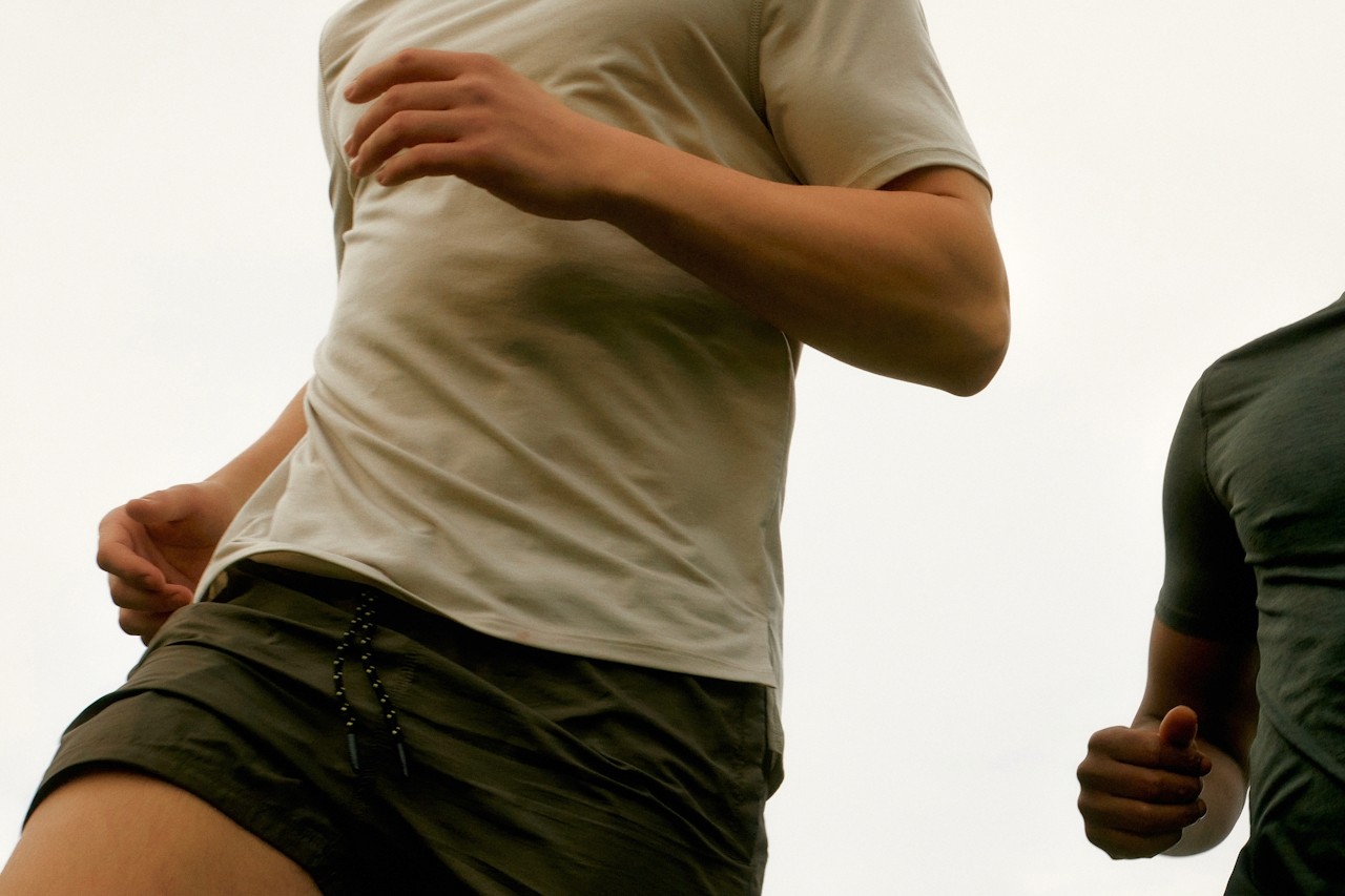
Photography / Videography
At Clubhouse™, we believe that high-quality photography and videography is an essential component of our brand. We use this content to showcase our participants, events, and sponsors. (Our sample gallery will be available shortly for reference).
Grids
Clubhouse™ uses a grid structure on the website design to ensure a clean, organised and visually appealing layout, while maintaining a consistent and balanced design. The grid enhances user experience and adapts to different screens. It aligns with our brand's minimalistic approach and focus on precision and attention to detail.
