About us
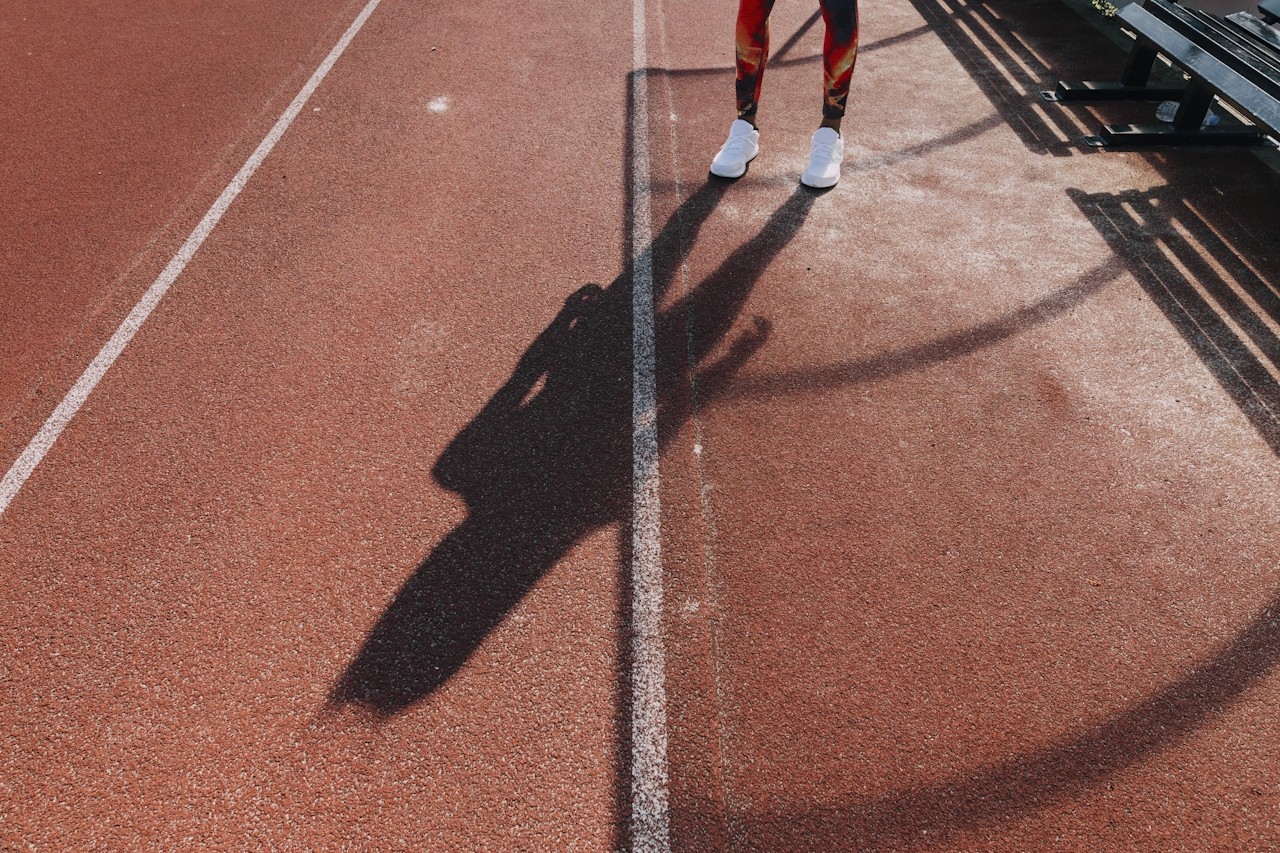
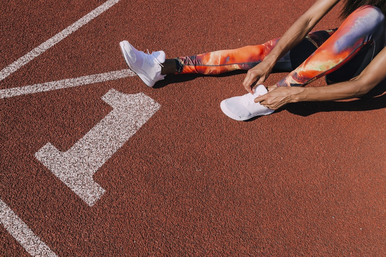
At the intersection of sport, culture, and community - Clubhouse™ creates a new playing field for media, participation, and partnerships in Aotearoa.
Our identity is built around delivering a fan first experience. The design system takes cues from traditional sports stadiums and recognisable markings that are synonymous with passion, community, and supporters.
The simplicity of the design system makes space for our content do the loud talking. If in any doubt while using this brand, "less is more" should be your guiding principle.
How Clubhouse™ engages with our community will continually evolve. Don't use these guidelines as gospel - take them as your starting point to create.

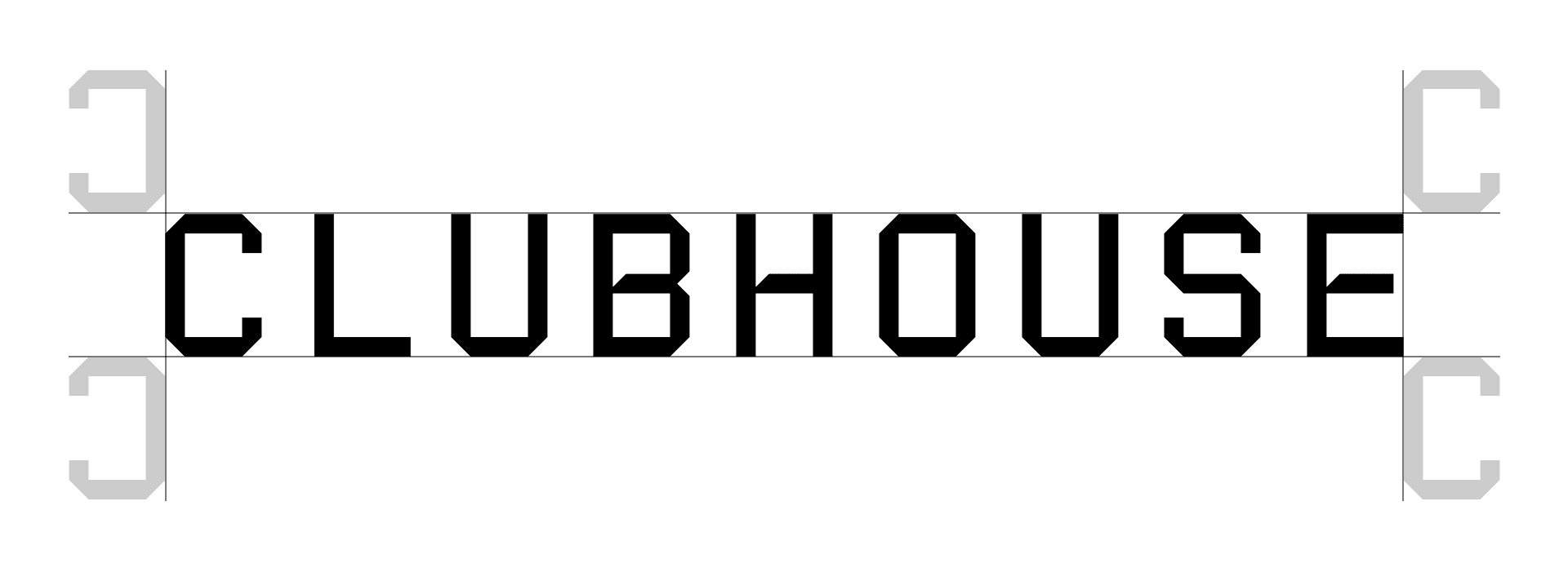
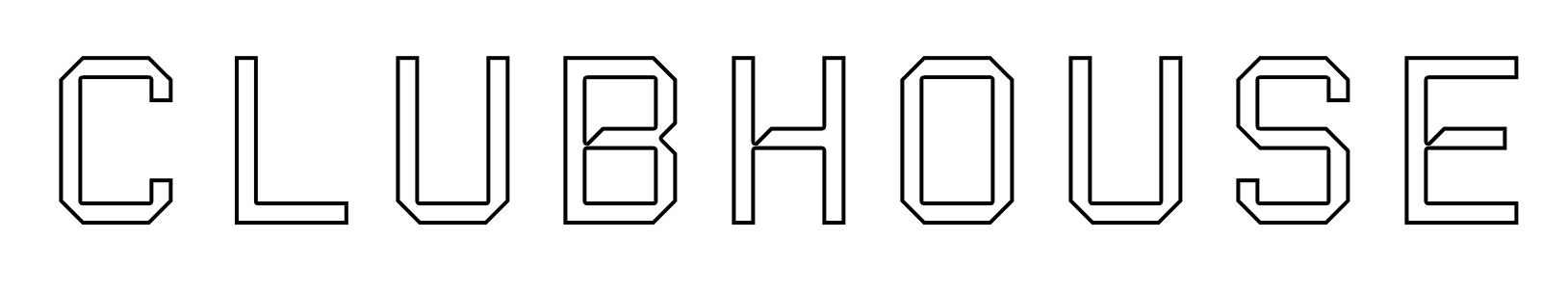
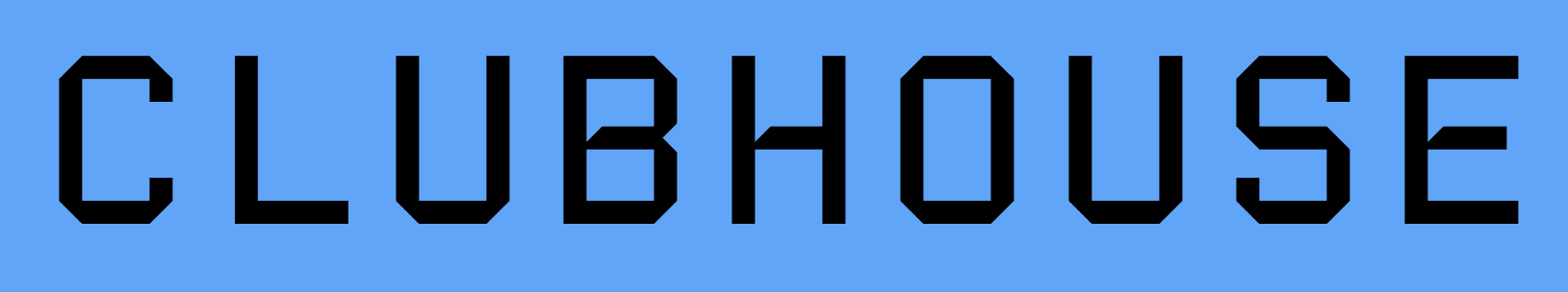
Primary Lockup
We lead with our wordmark as the hero of our identity. Our name represents our culture, and this should be used as the primary logo. For social profiles, tighter spaces, or vertical layouts - we use our round C-H mark. This connects to our digital channels, feels familiar for our social audience, and ties together our overall identity.


.75’’ or 50px
MINIMUM SIZE
This version is not intended for extremely small sizes. The minimum height is .75” for print applications and 50px for digital applications.
Clear Space
Clear space, or negative space, is the area that surrounds the logo that is completely clear of any other graphical element. Clear space helps the logo stand out from the rest of the elements on the page and ensures legibility, even at small sizes.
As a general rule, the more clear space around the logo, the better.
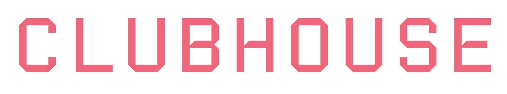
Color Variations
The primary colours of the Clubhouse™ identity all take cues from the field of play. These colours have been chosen to represent the authenticity of our brand. "Swish" (orange) is our primary brand colour, it's dominant, attention grabbing and a dynamic representation of our drive to push the boundaries of sports media. The "Turf" (green) forms an instant connection with most playing fields, and is easily adaptable to suit a variety of mediums. "Off-court" (white) is a neutral tone that reflects the well used sidelines of most surfaces. It's our workhorse, and a colour that is equally suited as both a background or foreground. You can never go wrong with "Scoreboard" (black).
Because of the difficult and ever-changing lighting environments that sport often takes place in. Our preference is to always use the logo with highest contrast for on screen graphics, broadcast, field of play signage, and any other visual assets that might be influenced by changing light conditions. This will mean that the 'Off-court" and "Scoreboard" colours should be used as preference in these situations.
Where we have greater control over the environment we can be more creative in our approach. "Turf" and "Swish" will create a meaningful presence when applied in environments like dark arenas or indoor stadiums, on merchandise, LED signage, digital display, and other online mediums.

Icon Only Lockup
The icon-only logo lockup for Clubhouse™ is a simplified version of the primary logo featuring the C-H in a round shape. This reflects the profile picture visuals from social media and is often how most people will have their first interaction with out brand. It should be useful in situations where the wordmark cannot be scaled appropriately. It can be used alone or in combination with the primary wordmark where space permits.

Logo Misuse
This page illustrates how not to use the Clubhouse™ logo. These examples represent some of the most common errors, but do not necessarily constitute an exhaustive list. To maintain consistency of the Clubhouse™ logo, follow the guidelines outlined in this document.
Never attempt to alter, redesign, or add to the Clubhouse™ logo lockup.
Do not change the logo color outside of the approved palette.

Do not apply a gradient or pattern fill to the logo.
Do not outline the logo.

Do not stretch, distort, or warp the logo in any way.

Do not crop or cut off the logo.

Do not change the typeface or recreate the Word mark.

Do not rotate the primary or icon versions logo.

Do not add a drop shadow or any other effect to the logo.
Do not position the logo over off-brand colors, patterns, or busy backgrounds.